
Visualising grid search results
#ml #gridsearch #visualisation #dendogram
20220127230937
When doing a hyperparameter optimisation using #gridsearch (or other tasks which involve an exhaustive evaluation of the search space) you end up with a large table of scores along with the used configuration that generated it.
from sklearn.model_selection import ParameterGrid
from tqdm.auto import tqdm

grid_search = {
        # model config
        "add_bias": [True, False],
        "dropout": [0.1, 0.8],
        "embedding_size": [8, 16],
        "lr": [0.001, 0.00001],

        # training procedure
        "batch_size": [50, 200],
        "shuffle": [True, False],
        "optimizer": [RMSprop, SGD]
}

repeats = 5
write_header()
for group, config in enumerate(tqdm(ParameterGrid(grid_search))):
    for _ in range(repeats):
        model = build_model_from_config(**config)
        history = train_from_config(model, **config)
        stats = compute_stats(history)
        write_stats(stats)
Which might results in something like
Index group	best_score	batch_size	dropout	embedding_size	lr	patience	shuffle
0	0	0.3668	5000	0.1	16	0.0100	5	1
1	0	0.3846	5000	0.1	16	0.0100	5	1
2	0	0.3780	5000	0.1	16	0.0100	5	1
3	1	0.3214	5000	0.1	16	0.0100	5	0
4	1	0.3665	5000	0.1	16	0.0100	5	0
...	...	...	...	...	...	...	...	...
187	62	0.3503	200000	0.8	64	0.0001	10	1
188	62	0.3483	200000	0.8	64	0.0001	10	1
189	63	0.3236	200000	0.8	64	0.0001	10	0
190	63	0.3257	200000	0.8	64	0.0001	10	0
191	63	0.3242	200000	0.8	64	0.0001	10	0
This table though is quite hard to interpret and reason about.
One thing you can do of course is pick the configuration that yields the highest score and be done with it but usually this is not the correct solution:
- that result may be due to luck
- that result probably only holds for this specific dataset
- that result may be an isolated case around it’s hyperparameter neighbourhood (and consequently not a very robust choice for a production ready configuration)
Using a dendogram heatmap
The thing that seems more reasonable is to create a [[20210605162007]] Dendogram heatmap out of this:
- first pivot the data so that you have half the hyperparameters on the index and half on the columns
- set the value to be the score of the gridsearch evaluation
- use the sns.clustermap plot on the poivot table
import seaborn as sns

sns.clustermap(df.pivot_table(
    values=['best_score'],
    index=['batch_size', 'dropout', 'embedding_size'],     # df.columns[:len(df.columns)//2]
    columns=['lr', 'patience', 'shuffle']                  # df.columns[len(df.columns)//2:]
), annot=True)
Which ends up looking like
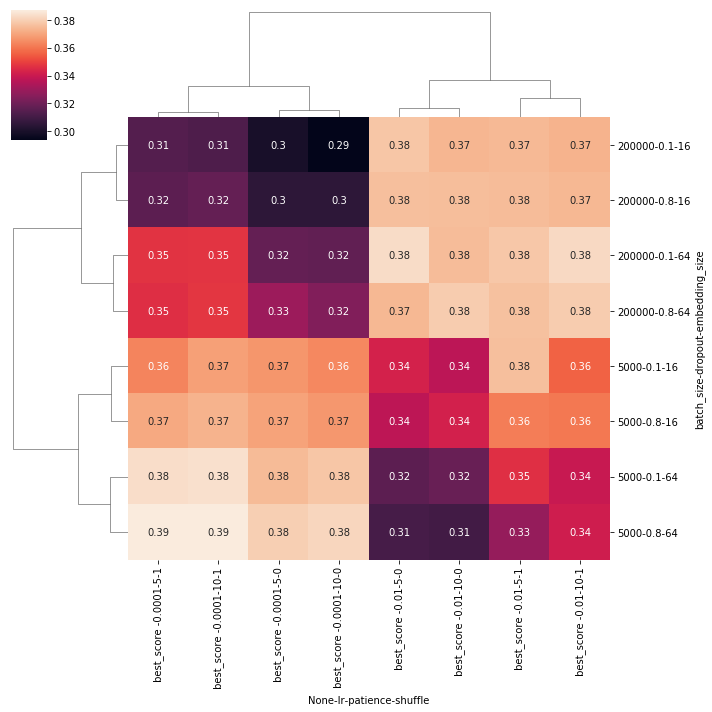 Here you can easily see that in the bottom-left corner is a whole region with the highest scores, and that is the best configuration that you could choose. Note that the
 pivot_table aggregated with the mean strategy all the scores that you’ve got for the multiple (5) evaluations we did for each configuration. We did this to eliminate luck as much as possible from the equation.
I bet you can also use the pivot_kws parameter to replace the inlined pivot_table, something along the lines of (didn’t manage to make it work though):
sn.clustermap(
    df,
    pivot_kws={
        'index': ['batch_size', 'dropout', 'embedding_size'],
        'columns' : ['lr', 'patience', 'shuffle'],
        'values' : ' best_score '
    },
    annot=True
)
Additionally, you can annotate the plot to show the group element so you can more easily grep for the best configuration
sn.clustermap(
    data=df.pivot_table(
        values=['best_score'],
        index=['batch_size', 'dropout', 'embedding_size'],
        columns=['lr', 'patience', 'shuffle']
    ),
    annot=df.pivot_table(
        values=['group'],
        index=['batch_size', 'dropout', 'embedding_size'],
        columns=['lr', 'patience', 'shuffle']
    )
)

In this case, the best config was from group 28, meaning:
{"batch_size": 5000, "dropout": 0.8, "embedding_size": 64, "lr": 0.0001, "patience": 5, "shuffle": true}
Other types of visualisations
Alternatively you can try to create something like a partial dependence plot as described on this thread.
Comments